The anatomy of a good product prompt
A product prompt has six layers: subject, light, lens, angle, atmosphere, and brand. Most people write only the subject and leave the rest to the model; the good result comes out of exactly that "rest." A set photographer has already made these six decisions before the shoot begins. Writing a prompt is putting those decisions into words.
The subject is what the product is and how it appears: cap open or closed, touched or untouched, where in the composition. Light sets the mood of the scene. Lens and angle say how the camera looks at the product. Atmosphere builds the background and tone. Brand governs color, material, and restraint. Think of the skeleton like this:
[subject] + [lighting] + [lens/angle] + [atmosphere] + [brand cues] + [technical: aspect ratio, no text]Translating light into a prompt
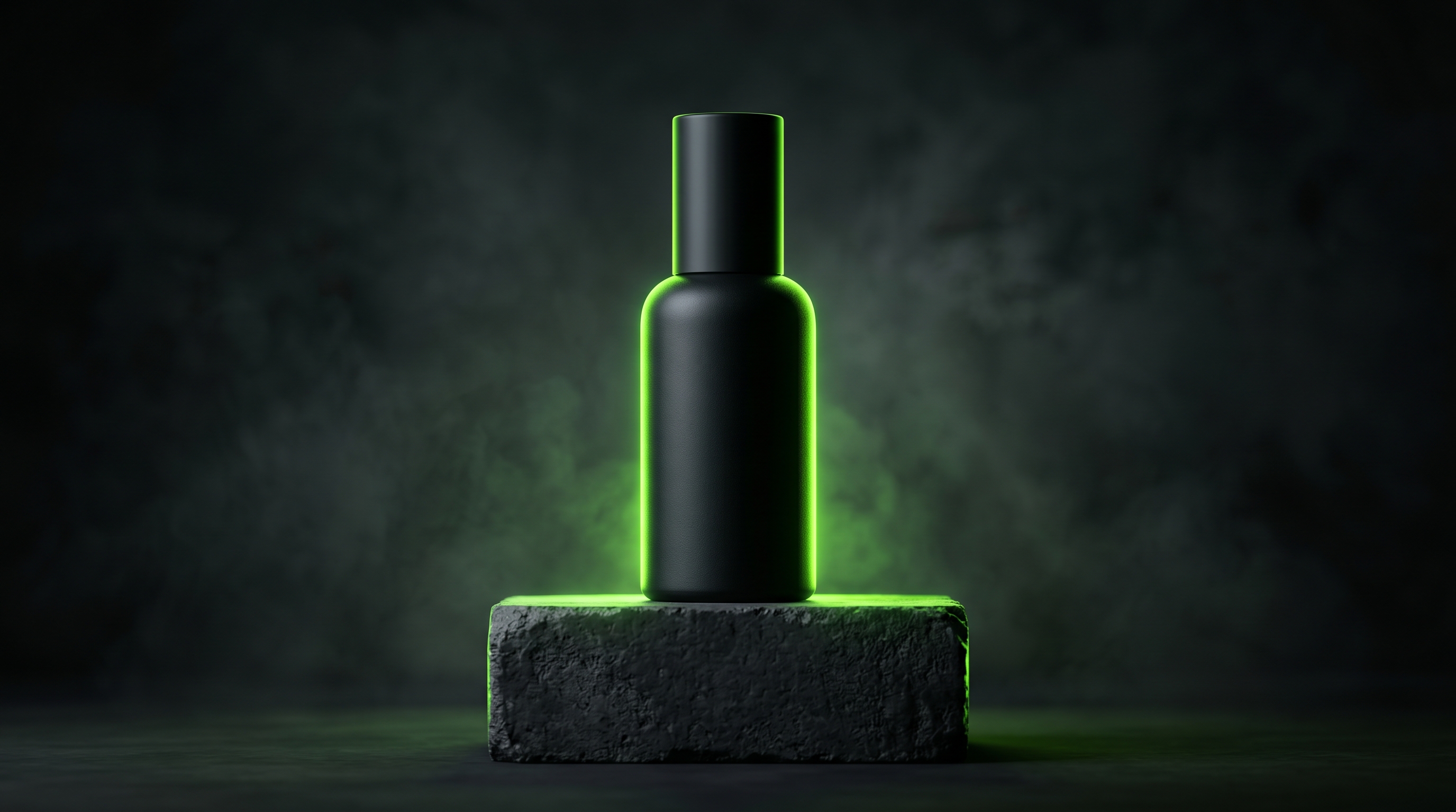
Light is the most decisive layer in product photography. What we say on the set — "bring the softbox to 45 degrees, add a reflector for fill" — has to be translated into the prompt. GPT-4o reads lighting terms surprisingly well. Hard shadow or soft falloff, where the highlight should sit, whether there's a backlight — all of it can be written.
A few practical translations: for a soft, clean look use soft diffused softbox light from 45 degrees, gentle shadows; for a luxury, dramatic feel use single hard key light, deep shadows, dark background, rim light on the edge; for a fresh, natural feel use natural window light, morning, soft falloff. Stating the direction and hardness of the shadow is what sets the output apart between "amateur" and "studio."
Lens and composition terms
Camera language makes a prompt professional. 85mm compresses the product and softens the background, ideal for jewellery and cosmetics. A macro lens brings out texture and detail. 35mm shows the product inside a space, in a lifestyle context. For angle, writing eye-level, top-down flat lay, or low angle hero shot sets the composition directly.
Depth of field is a composition tool too. shallow depth of field, background softly blurred lifts the product forward; deep focus, everything sharp gives catalog clarity. When you add these terms, GPT-4o tries to build the frame you described rather than a random composition.
Copy-ready templates
Paste the templates below straight into ChatGPT and fill the square brackets with your own product.
Cosmetics / care product:
A [serum bottle] on a marble surface, soft diffused softbox
light from the left at 45 degrees, gentle shadows, 85mm lens,
shallow depth of field, beige and off-white palette, minimal
clean composition, product label sharp and legible, commercial
product photograph, no text overlay, 4:5 portrait.
Food / drink:
A [coffee cup] on a wooden table, natural window light from
the side, morning mood, steam rising, warm tones, 50mm lens,
shallow depth of field, fresh and inviting, commercial food
photograph, no text overlay, 1:1 square.
Tech / accessory:
A [wireless earbud case] floating on a seamless dark grey
background, single hard key light from top, deep shadows, rim
light on the edges, macro lens, sharp detail, premium minimal
look, commercial product photograph, no text overlay, 16:9.
Fashion / textile:
A [leather handbag] on a neutral linen backdrop, soft daylight,
gentle falloff, 85mm lens, shallow depth of field, visible
texture and stitching, muted earthy palette, editorial product
photograph, no text overlay, 4:5 portrait.
Common mistakes
The most common mistake is piling on adjectives. Words like "stunning, beautiful, amazing, premium, luxurious" tell the model nothing; light and lens do. The second is contradictory instructions: asking for "soft light" and "hard shadows" in the same prompt leaves the model stuck in the middle. The third is not describing the product; writing "an amber glass bottle with a gold cap and a narrow neck" instead of "a bottle" puts the output under control.
Another mistake is forgetting the negative instruction. Adding no text overlay, no watermark, no extra objects clears the clutter. Last, not stating the aspect ratio; if you don't write 4:5, 1:1, or 16:9 to fit your platform, the model defaults and the image becomes unusable.
Brand-specific consistency tips
Across a campaign, dozens of images need to speak the same language. The way to do it is to keep a fixed "brand block." Define the color palette, light character, and composition approach once, then paste the same thing into every prompt: brand style: muted beige palette, soft diffused light, minimal centered composition. When you change only the subject and keep this block fixed, the series stays consistent.
Uploading a reference image raises consistency too. Uploading an output you liked before and saying "keep this light and tone, change the product" lifts brand fidelity noticeably, because the model carries the reference it has rather than guessing. For sensitive elements like logos and on-pack text, don't trust the model; add that layer afterwards on the design side.
When professional production is needed
However well the prompt is written, some jobs need the judgment of a person and real light. Reflective surfaces, luxury products with real texture value, colors that need Pantone precision, and hero images that are the face of the brand — on these the prompt gets you to 80 percent, and the remaining 20 takes experience. Deciding correctly which image is produced with AI and which on the set is what sets the quality of the result.
At PAM Istanbul we make this call together on every project. We run prompt writing, brand style block setup, and post-production review with the same discipline. The aim isn't to produce images fast but to meet what your brand expects from that image.
Let's build this together.
Whether it's a single campaign or a year-long production partnership, we bring the same playbook that works for Cartier, Mercedes-Benz, Nike and Pierre Cardin. We mentor your team as we deliver — transparent process, documented AI decisions, no black boxes.
Email: [email protected]
Phone: +90 530 267 49 29
Studio: Yayıncılar Sok. 10/3, Seyrantepe · Istanbul