What is three-point lighting?
Every professional set is built on three lights, and each has a defined role in the frame. The key light is the main light, placed at 45 degrees to the subject at eye level. It shapes the subject, sets the shadow and establishes the mood of the scene. The fill light sits on the opposite side of the key and runs a stop lower in power — its job is to soften shadows and keep contrast readable. On commercial shoots the key-to-fill ratio is usually 2:1; it climbs to 4:1 when a scene needs drama. The rim light goes behind the subject at 135 degrees. It separates the subject from the background and creates depth.
The fourth layer — practical — is the sources inside the scene: a desk lamp, screen glow, candlelight, a street lamp. Practicals may not do the technical work of lighting the subject, but they add meaning and realism. When all four layers work together, the scene convinces emotionally as well as visually.
This logic isn't only for portraits. It holds for product still life and interior architecture too. On a product shot the key reveals the form, the fill manages the contrast range, the rim separates the product from the background, and the practical adds a layer of story — a flame beside a perfume bottle, screen glow next to an electronic product.
Why lighting language matters in AI prompts
Type "a woman in a studio" into Midjourney and the model's default lighting is usually flat and directionless. It looks characterless, amateur, pinned to the wall. Add "soft key light from 45° left at eye level, 2:1 fill ratio from camera right, warm tungsten rim backlight separating subject from dark background" to the same prompt and the scene approaches commercial quality. The difference isn't only aesthetic — it's a difference in technical reliability.
The reason is this: inside the millions of images they were trained on, models recognise lighting terms from the metadata and captions attached to those images. Talk the way a cinematographer writes and the model draws on the learning weights tied to images made at cinema quality. Talk in generic words and it produces generic results. The output gap between "studio photo" and "Arri-lit three-point setup, soft key at 11 o'clock, 4:1 contrast ratio, warm practical glow" can be larger than most people expect on a first try.
Prompt template: key / fill / rim / practical
The base structure we use is: [subject], [key direction and softness], [fill ratio], [rim temperature], [practical source], [atmosphere]. Here's how it works across three subject types.
Portrait / headshot: "Professional female executive, soft large-format softbox key from 45° upper-left at eye level, 2:1 fill ratio from camera right with reflector, cool daylight rim separating from neutral grey background, practical window light glow from frame left, clean corporate mood, Canon 85mm f/1.4 compression"
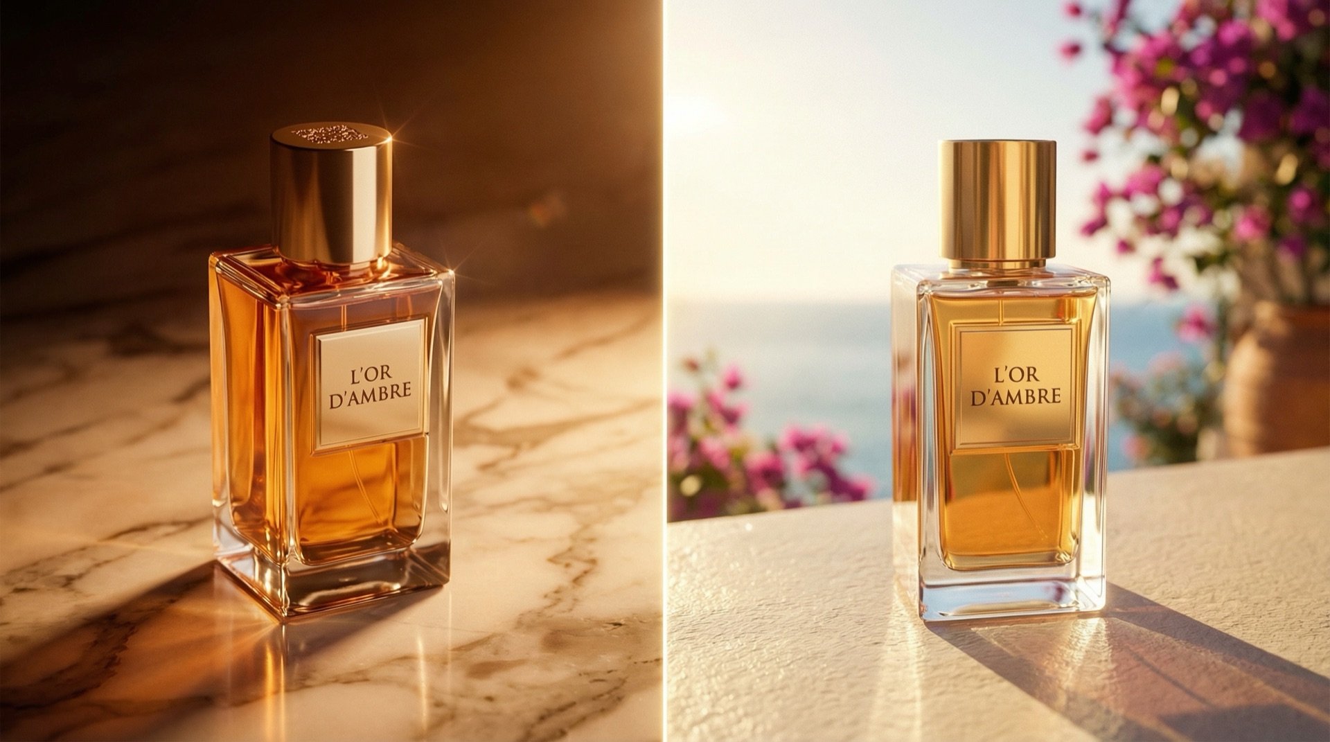
Product still life: "Ceramic perfume bottle on dark marble surface, large softbox key from upper-left at 45°, 1:4 fill ratio adding subtle shadow depth, cool tungsten rim backlight separating product from black background, practical amber candle glow off-frame left, moody editorial mood, macro 100mm focus-stacked"
Interior architecture: "Modern living room interior, soft bounce key light from large north-facing window at camera left, low fill maintaining shadows, warm practical floor lamp glow in background, additional rim from secondary window separating furniture from wall, golden hour atmosphere, wide angle 24mm, slight tilt-shift effect"
Add lens, film and camera language too
Lighting language alone isn't enough; camera language shapes the character of the result too. Models recognise references to lens, film stock and camera angle, and use that information in the render.
For depth of field, name the focus point in the prompt: "shallow depth of field, subject in focus, background bokeh" should be standard for portraits. For products, "deep focus, full product sharpness" is often more appropriate. Define the camera angle clearly as well: eye level is natural and professional; a slightly high angle reads as authority and power; a top-down view produces tableau-like compositions for product and architecture.
Film stock simulation lifts realism noticeably. "Kodak Portra 400 film grain" adds a warm, near-analogue texture to portraits. "Fuji Velvia 50" brings high saturation and sharp contrast to landscape and product images. ISO simulation works too: "ISO 3200 grain texture, gritty reportage feel" gives a scene a documentary character. Camera-brand references help — phrases like "medium format Hasselblad colour rendering" or "Phase One tonal range" trigger the model to apply the learned aesthetic tied to that camera.
Block the amateur look with negative prompts
A negative prompt tells the model what you don't want. In Midjourney you use the --no parameter; in Runway and other tools, "avoid" or a similar syntax. The list below pairs common "AI look" problems with the negative-prompt terms that prevent them.
flat lighting — blocks directionless, shadowless, surface-level light. harsh shadows — prevents over-hard shadows that eat detail. amateur photography, phone camera quality — steers the model away from low-quality references. overexposed highlights — blocks blown-out, detail-losing bright areas. underexposed shadows — prevents fully crushed, information-free dark areas. plastic skin texture — blocks the over-retouched, textureless skin look. lens distortion, fisheye effect — prevents unwanted perspective warping. blurry, out of focus — clears general sharpness issues. stock photo feel, generic composition — blocks the clichéd corporate stock look. oversaturated colors, HDR effect — prevents over-processed colour. watermark, text overlay — keeps stray text out of the image.
Adding this list to your prompt can halve your post-production time. Skin texture and light quality are the two issues that take longest to fix in Photoshop — a negative prompt filters both at the generation stage.
Seven short rules we learned on set
1. State the light direction by clock position. "Left side" is vague. "Key light at 11 o'clock" directs the model clearly and gives consistent results. 2 o'clock means the right side; define every angle by clock position.
2. Write the fill ratio as a number. "Soft fill" is open to interpretation. "1:2 fill ratio" sets a fixed contrast target. For commercial work, 1:2 or 1:3; for cinematic drama, 1:6 or 1:8.
3. The rim light's colour sets the emotion. A tungsten rim is warm and classic, common in fashion and beauty. A neon rim builds an urban, modern mood. A cool daylight rim produces a corporate, clean result. Specify the colour; don't leave it to the model.
4. Add a practical to every scene. A scene with no practical looks like a "studio box" — unconvincing, unlived-in. A candle, screen glow or window reflection makes the scene instantly believable.
5. Try the same prompt with three different fill ratios. Before the final render, run three takes at 1:2, 1:4 and 1:8. The most convincing contrast range often turns out different from what you'd predicted.
6. Keep the practical and rim colours compatible. A cool blue rim next to a warm amber practical creates set inconsistency. A difference of at most 300K between the two works as a usable limit.
7. Pin down the camera angle in every prompt. "Eye level" is plain but the right starting point. "Slightly above eye level, looking down at 15 degrees" makes a product read larger in product shots; "slightly below eye level" gives portraits a sense of authority and power. Without a stated angle, the model picks at random.
Let's build this together.
Whether it's a single campaign or a year-long production partnership, we bring the same playbook that works for Cartier, Mercedes-Benz, Nike and Pierre Cardin. We mentor your team as we deliver — transparent process, documented AI decisions, no black boxes.
Email: [email protected]
Phone: +90 530 267 49 29
Studio: Yayıncılar Sok. 10/3, Seyrantepe · Istanbul